

Family Business Case Study


![]()
PROJECT OVERVIEW

After conducting research on the top ten tattoo shops in London, it has become apparent that many of them have poor UI/UX websites. As a result, I decided to take a closer look at one particular shop, The Family Business, which has a strong reputation and has been established for some time. However, upon visiting their website, I was disappointed to find that the user flow was not up to par and no booking system was in place. The lack of scroll and ease of navigation on the site proved to be a frustrating experience for me. Despite their reputable business, their website left something to be desired in terms of a smooth and intuitive user experience.
I noticed a significant inconsistency in the UI and layout when researching and navigating artists. The experience was suboptimal, with the UI appearing to be different across the site and a lack of visual coherence. As a result, this inconsistency impacted the overall UX, detracting from the ease of use that users expect.
One specific issue was the Studio page layout, which was intended for mobile devices but appeared disorganized when viewed on the web. This is a common challenge for web designers and developers, who must consider how their designs appear on different screen sizes and resolutions. Unfortunately, in this case, the design was not optimized for web mode, resulting in a cluttered and confusing layout that was not user-friendly.
This issue highlights the importance of considering the overall user experience and testing designs on multiple devices before deploying them. While mobile-first design is increasingly becoming the standard, it’s essential to consider users’ experience accessing the site from a desktop computer, tablet or other device. This can be achieved through the use of responsive design techniques and testing on multiple devices. The inconsistency in the UI and layout of the art-related website had a negative impact on the user experience, with the Studio page layout being a particular issue in web mode. This serves as a reminder of the importance of considering the overall user experience and ensuring that designs are optimized for different devices to provide a seamless and intuitive user experience.
![]()
STYLE GUIDE
Oswald – Clean, modern lines and uniform letter spacing and better fit the pixel grid of standard digital screens.
Open Sans Condensed – Open Sans is narrower than the regular version, which makes it a great option for designs that need to fit a lot of text into a small space.
Germania One – Clean look that is both bold and stylish. It has a strong presence and is well-suited for use in designs that require a modern and sophisticated feel.
![]()


![]()

![]()
PROBLEMS AND SOLUTIONS
 The landing page of a website plays a crucial role in creating a good first impression on potential customers. Unfortunately, in this case, two issues hindered the landing page’s effectiveness. Firstly, the text and overall layout choices of the landing page were deemed inadequate, which may have led to customers losing interest and leaving the website. Secondly, the inability to scroll on the landing page compromised the user experience, hindering customers’ engagement with the website’s content. These issues could have had significant negative consequences, potentially leading to the loss of valuable leads and sales. Therefore, it is crucial for businesses to prioritize the design and functionality of their landing pages to ensure they are effectively engaging with potential customers and maximizing their online presence.
![]()
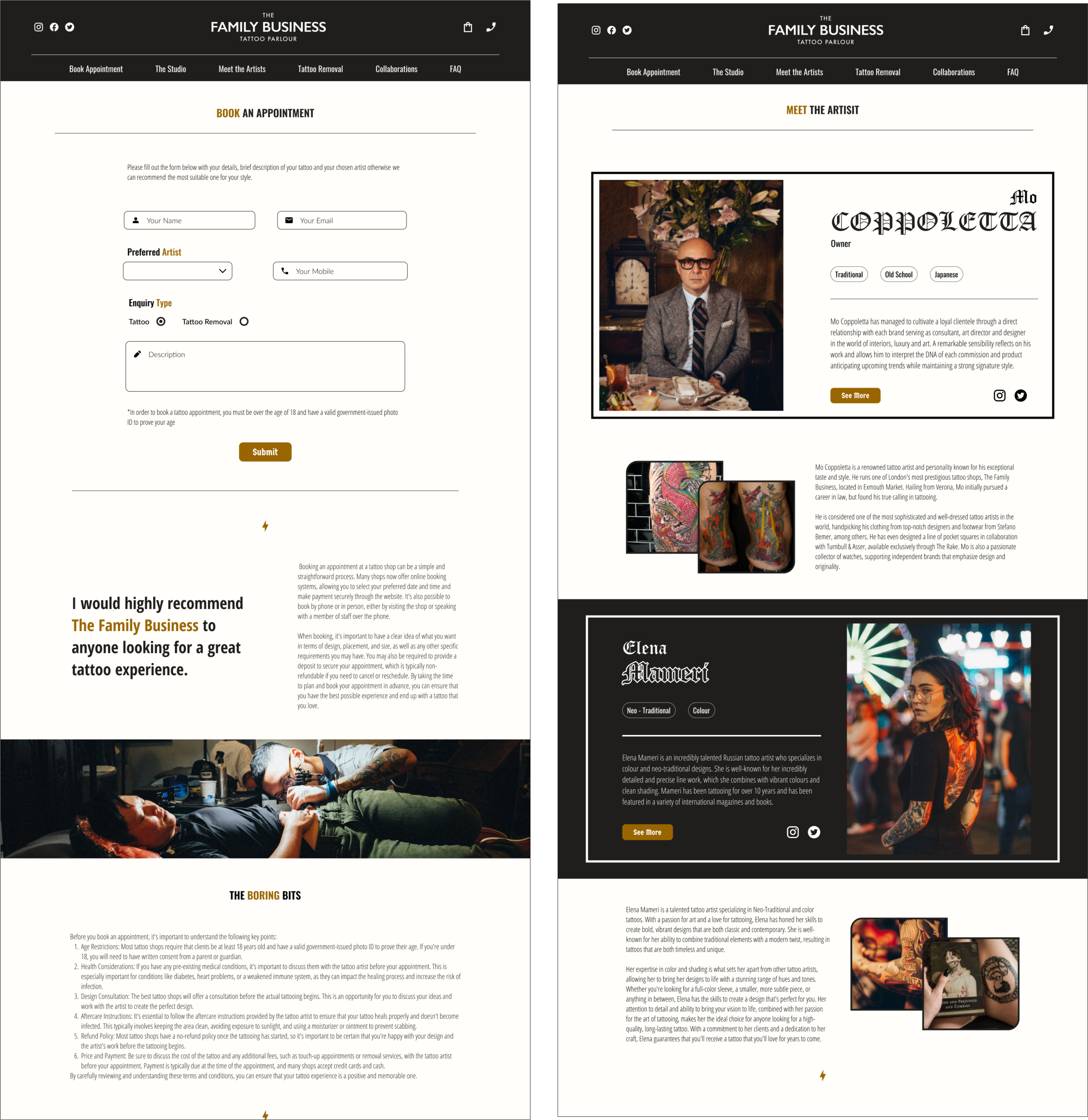
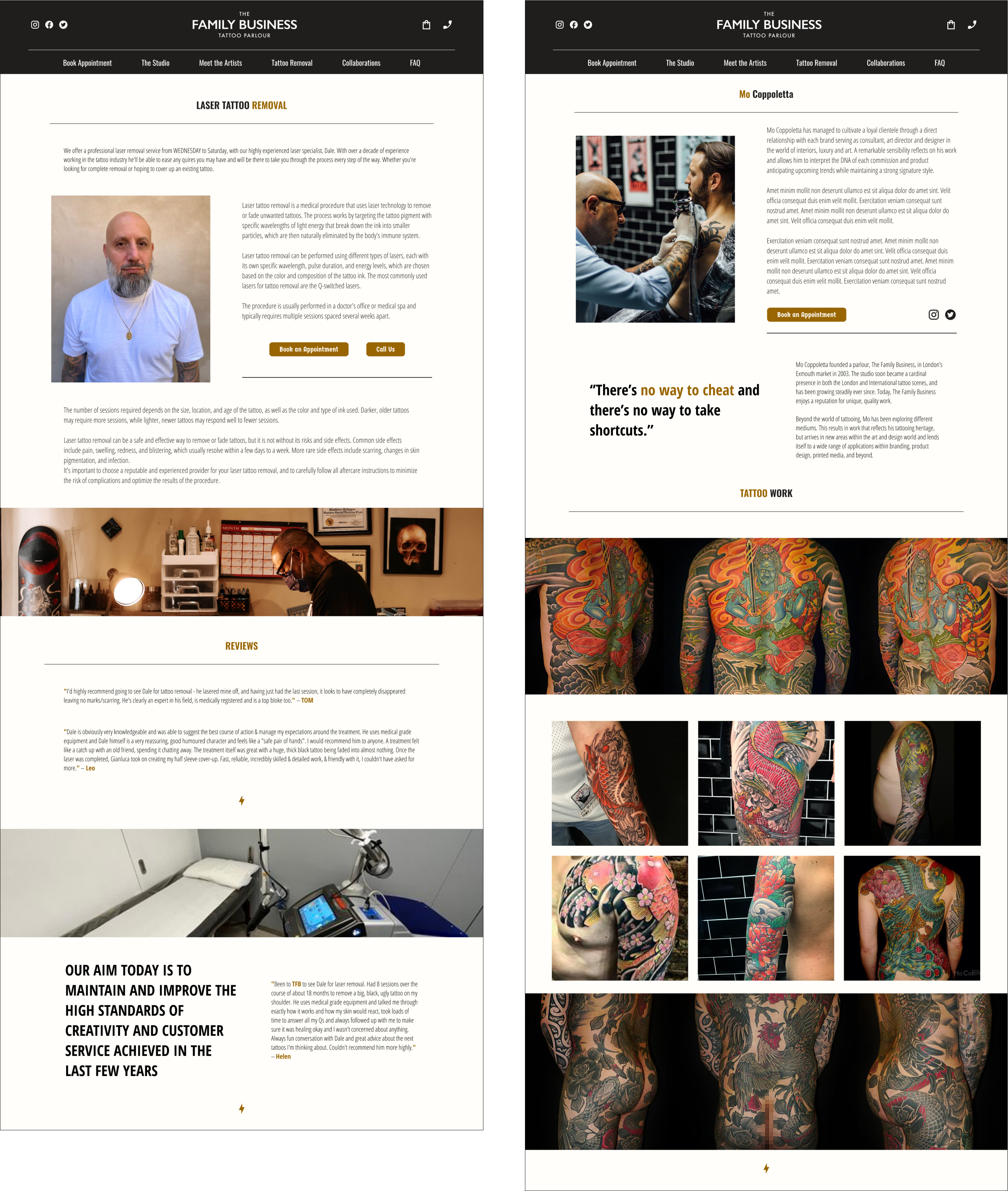
To address the issues with the landing page, I implemented several changes. Firstly, I added more content to the homepage and broke down the original content into smaller, more manageable sections. As you can see from the images below, I kept the scroll-able top image and added anchor points below to make it easier for users to navigate through the content.
Additionally, I created a “Meet the Artist” block that provides a preview of each artist and their specialties. This feature helps to engage potential customers by giving them a better sense of the artists’ work and expertise.
Finally, I added a book appointment feature directly to the main page. This eliminates the need for customers to navigate away from the page to book an appointment, providing a more seamless and streamlined experience.
Overall, these changes are designed to enhance the user experience and make it easier for potential customers to engage with the website’s content and services. By breaking down the content into smaller, more manageable sections, providing more information about the artists, and adding a convenient booking feature, we hope to improve customer engagement and boost the website’s conversion rate.

![]()
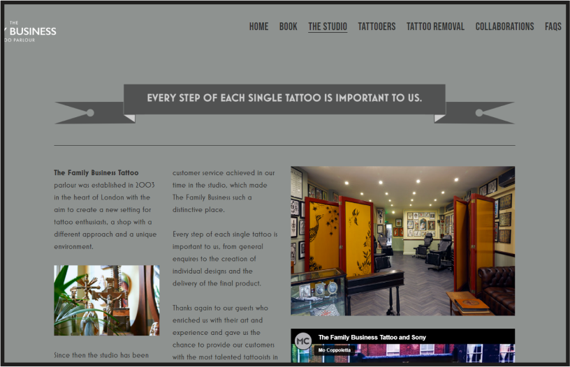 The Family Business Tattoo Shop’s website should provide users with an enjoyable and seamless experience that reflects the quality of the studio’s work. However, the current layout of the studio page fails to achieve this. Although the studio is beautifully designed, the mobile-first approach of the page means that it appears cluttered and disorganized when viewed on a desktop browser, which negatively impacts the user experience.
To improve this, it’s important to address the issues with the page layout. One approach would be to adopt a responsive design that adjusts to different screen sizes, allowing users to view the studio’s features and designs on both mobile and desktop browsers. This ensures that users have a consistent and optimal viewing experience, no matter what device they’re using.
![]()
Additionally, utilizing visual design elements like high-quality images and videos can better showcase the studio’s work and highlight their unique designs. This approach can make the studio’s page more visually appealing and engaging, improving user retention, and overall customer satisfaction.
By addressing the issues with the page layout and adopting a responsive design that caters to all devices, the Family Business Tattoo Shop’s website can provide users with an exceptional and enjoyable user experience that highlights the beauty and functionality of their stunning studio.

![]()
Additional Pages
![]()
![]()