
Mobile Phone Insurance Direct Checkout Layout Design (UX/UI)
I had the chance to revamp the checkout system, aiming to enhance sales conversion and ensure a smoother user experience (UX) for the customers, all while adhering to the branding guidelines.


![]()
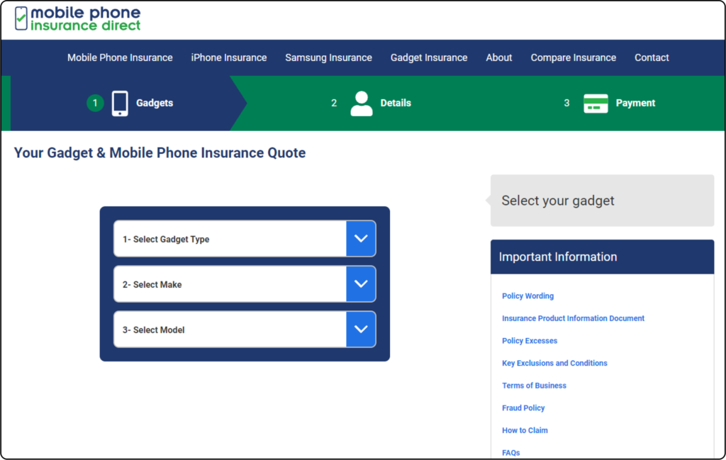
Reviewing Previous Design
Placing the ‘Select your gadget’ or Call to Action button in a dulled box on the right side results in poor UX due to reduced visibility, confusion, frustration, and limited accessibility. Stacked dropdowns restrict layout for excessive information, highlighting the importance of considering width limitations in design while allowing more flexibility in length. There is no clear step process when selecting the device. Additionally, excessive empty space is caused by the triple dropdowns placement
![]()
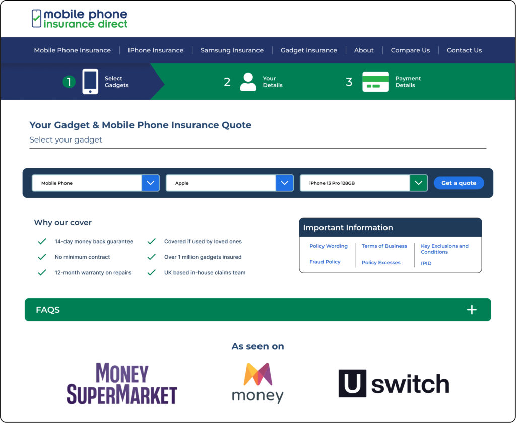
Reviewing Redesign
I took the time to add more detail to the steps on the header, providing information to users about the number of steps involved and the required information. I made the decision to move the ‘Select your gadget’ to the left-hand side and transformed it into a sub-title, enhancing its prominence and importance. Additionally, I redesigned the dropdowns, incorporating a layout bar and a call to action button. This not only reduced the space occupied but also allowed for more freedom in displaying additional information and design elements on the landing page. By introducing smaller dropdowns, I was able to incorporate an information box and an FAQ bar. Collectively, these changes contribute to a more professional and polished appearance for the overall checkout design
![]()