Mighty Bean Coffee
Design an application for Mighty Bean Coffee’ customers to click and collect their hot drink order. Operating for over 30 years, family is at the heart of everything Mighty Bean Coffee does. Looking at new ways to move the company forward, the owner of Mighty Bean Coffee wants to launch a click and collect service at his coffee shop. Although the footfall is strong, he feels having this option where customers can order ahead of time and collect, will encourage more people to use his local coffee shop over competitors. The Mighty Bean Coffee is a small stall based in the business district of Camden. The majority of its customers are people traveling to work and offices within the city and the most popular hours are through the morning rush (6am-10am).
The most important thing for the new app design is the ‘Click and Collect’ feature. I’ve been told by the client that this must be at the feature point of the app so that customers can find it easily.

![]()
Design System
To maintain the consistency of the design, I created a guide that contains the components that will fill the design. Before adding life to my designs I created a style guide that housed the following library:
Colors – Typography – Headlines – Buttons – Icons – Images
Every style guide will look different, but they should consistently be easy to understand, clean, and well organized. Note: This style guide is the most recent, and the assets are updated to show my final UI kit for this project.

![]()
Icon
![]()
User Flow

![]()
Hi-Fi Mock Ups
For this research project, I set out to develop a complete design process for improving the experience of ordering coffee through an app. Specifically, it had to do with the ability to track. Synthesizing common themes and ideas, making paper sketches of design flows, wire framing, creating low and high-fidelity mockups, and live prototyping. Iterations after each user test were performed to improve the overall user experience. For me, the entire process took approximately seven weeks to complete.
I employed standard UI/UX best practices and was the designer, project manager and researcher for the entire design sprint. Figma was the prime design tool for all of my wireframing and prototyping.

![]()
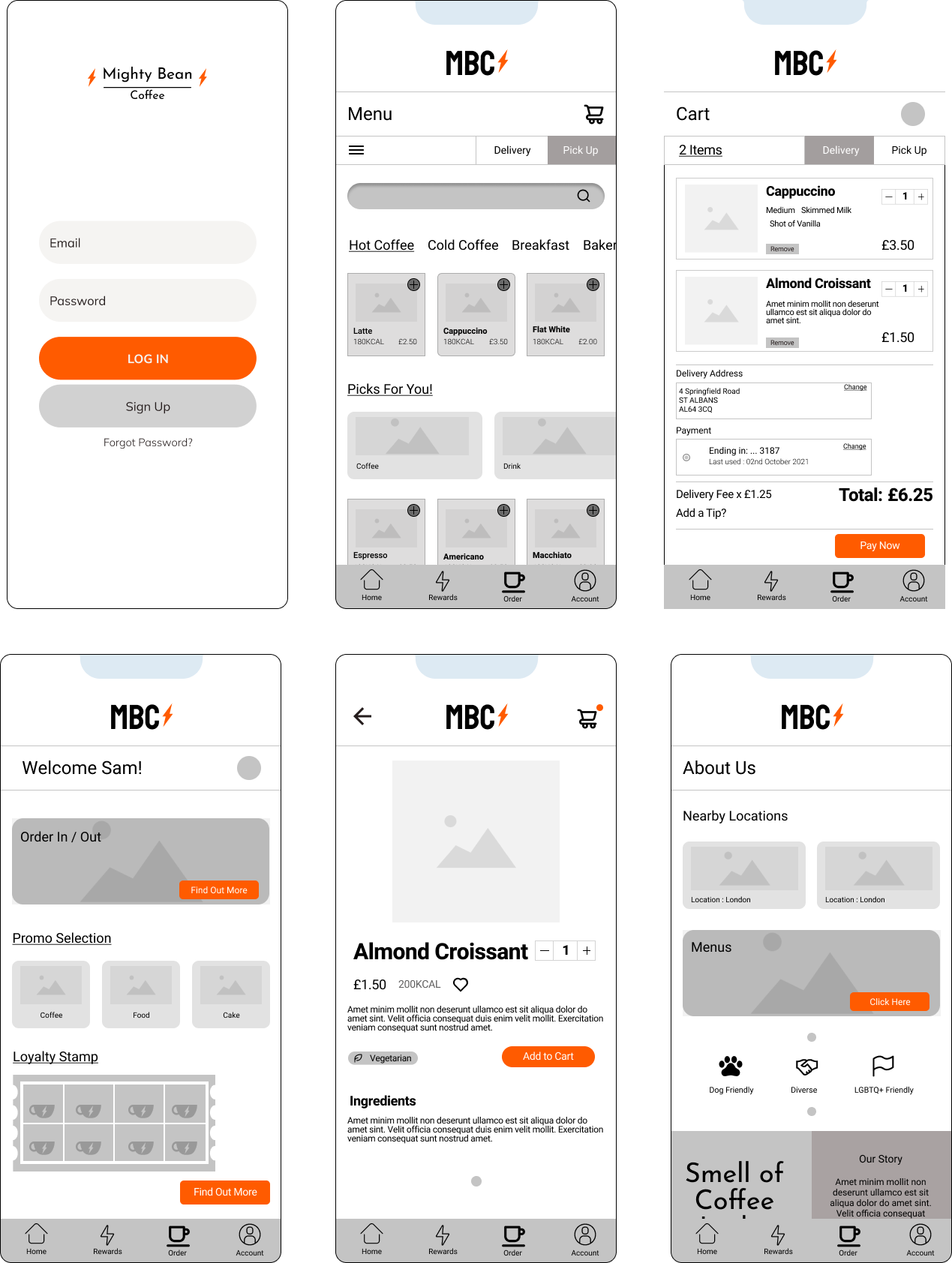
Wireframe
I created a wireframe to determine the outline of the site structure and layout, as well as displaying the basic user interface (UI) of the application to be made. The following is the wireframe of the Mighty Bean Coffee application:
I did a low fidelity prototype, then decided to do user testing so as to ensure the journey to completing set tasks was seamless. I tested the lo-fi with 5 participants in a non-moderated environment, then asked a series of questions to get their thought process as to what made the task uneasy. This helped with determining the little flaws in the user experience. afterward, I documented the experience with themes in the affinity map.