

KızBaşına Case Study
The Turkish charity focused on educating women’s rights underwent significant improvements to its website. The previous version failed to effectively communicate its mission and target audience.
Furthermore, the layout lacked structure, making it challenging for individuals in need to find crucial information.
To address these issues, a scroll feature was incorporated into the home page and featured landing page, enabling visitors to access key information more easily. Additionally, vibrant colours were introduced, creating a welcoming atmosphere, while additional buttons and impactful images enhanced the overall appeal.

![]()
Problem Statement
This design suffer from a critical flaw: they were created with the wrong demographic in mind. The text-based layout, although it may have been intended to convey a more serious tone, falls short of engaging the target audience effectively. The absence of a featured image further diminishes the visual appeal and fails to capture the attention of users. To improve the UI/UX and design, it is crucial to conduct thorough research and understand the needs and preferences of the intended demographic, ensuring that the layout, tone, and visual elements are aligned with their expectations. Only by carefully considering the target audience can a design truly succeed in delivering a compelling and engaging experience.

Proposed Statement
The proposed design adopts a friendly approach, keeping children and women in mind. The layout is carefully designed to create a more breathable and inviting experience, allowing users to navigate and engage with ease. A featured image is incorporated to capture attention and establish an immediate connection, enhancing visual appeal. The educational aspect is emphasized, ensuring that the content is informative and accessible to the target audience. By prioritizing the unique needs and preferences of children and women, this design aims to create a delightful and inclusive user experience that encourages learning and fosters a sense of empowerment.
![]()
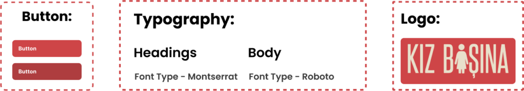
Design System
I decided to go with a softer colour palette compared to the previous black and white approach. This was keeping in mind that Kiz Basina is an educational website aimed at Young People and Women throughout Turkey.
Going a with Montserrat was key decision as the website would need to translate in to English and Turkish.
![]()
Hi-FI: Web and Mobile Version
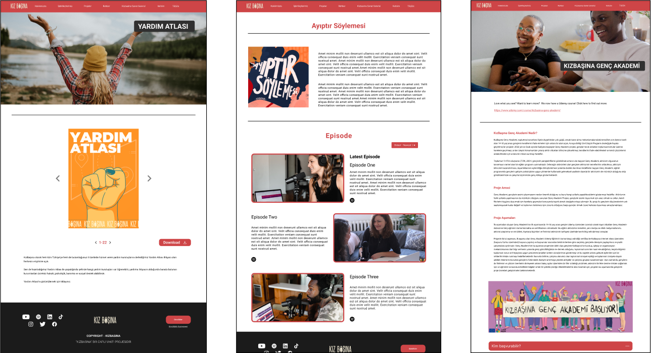
The addition of colors to a website can have a significant impact on its overall visual appeal and user experience. Colors play a crucial role in creating an inviting and approachable atmosphere, as they can evoke certain emotions and set the tone for the website.
By incorporating colors into the design, the website becomes more vibrant and visually engaging. The carefully chosen color palette can enhance the overall aesthetics, making it more appealing to the users.
For example, warm and inviting colors like shades of blue and green can create a sense of calmness and trust, while bright and bold colors like red and orange can generate excitement and energy.
In addition to colors, the inclusion of additional buttons can greatly improve the website’s usability. Buttons serve as interactive elements that guide users through various actions and functionalities. With more buttons strategically placed, users can easily navigate through the website, access different sections or pages, and perform specific actions such as submitting forms or making purchases. The presence of clear and intuitive buttons enhances the user experience by making the website more user-friendly and accessible.

![]()
User Flow
![]()
