
Giant Redwood – Case Study
When booking my American trip, I found that many local business have poor web design, With this in mind. I got to work on how I can improve this small RV campsite. In this case study, I will outline my journey and the steps taken to revamp the UX and UI of the campsite’s digital platform, aiming to attract more visitors and provide them with an exceptional camping experience.
Original Site
The issue with the UI/UX of this website is that the logo is too large and the icons and call-to-action (CTA) button are too small and unreadable. This can lead to confusion and frustration for users, as they may have difficulty finding important information or completing desired actions. To resolve this issue, the logo should be scaled down to a more appropriate size, and the CTA button should be made more accessible by increasing its size and visibility. Additionally, the dropdowns are hidden and the colour chosen makes it difficult to see the wording. This can make it harder for users to navigate and find what they’re looking for. To solve this problem, the dropdowns should be made more visible and the colour scheme should be adjusted to improve visibility.
 Another problem with the website’s UI/UX is that the spacing is not balanced. This can cause a cluttered and overwhelming feel for users, making it hard for them to focus on important information or CTAs. Additionally, the mailing list feature is not given enough priority and another CTA for booking should be prominent on the landing page. This way, users are more likely to complete the desired action and it will be more accessible to them. To improve this, the background colour could be changed and new icons could be used to highlight key features. This will help to draw attention to important information and make it more visually appealing.
The chosen image is portrait instead of landscape, causing a poor balance of spacing and negatively impacting the overall design. This can make the website look unprofessional and can be confusing for users, as it will break the flow and balance of the design. To fix this, the image should be replaced with a landscape image that fits the layout and design of the website. This will help to create a more cohesive and polished look for the website.
In conclusion, there are several issues with the UI/UX of this website that can lead to a poor user experience. By resolving these issues, such as scaling down the logo, making the CTA more accessible and visible, improving the visibility of the dropdowns and the colour scheme, having a balanced spacing, highlighting the key features, making the mailing list a priority and having a prominent CTA for booking, and changing the portrait image to landscape, the website will be more user-friendly and visually appealing. These changes will help to improve the overall user experience and make the website more successful in achieving its goals.

Logos

Redesign
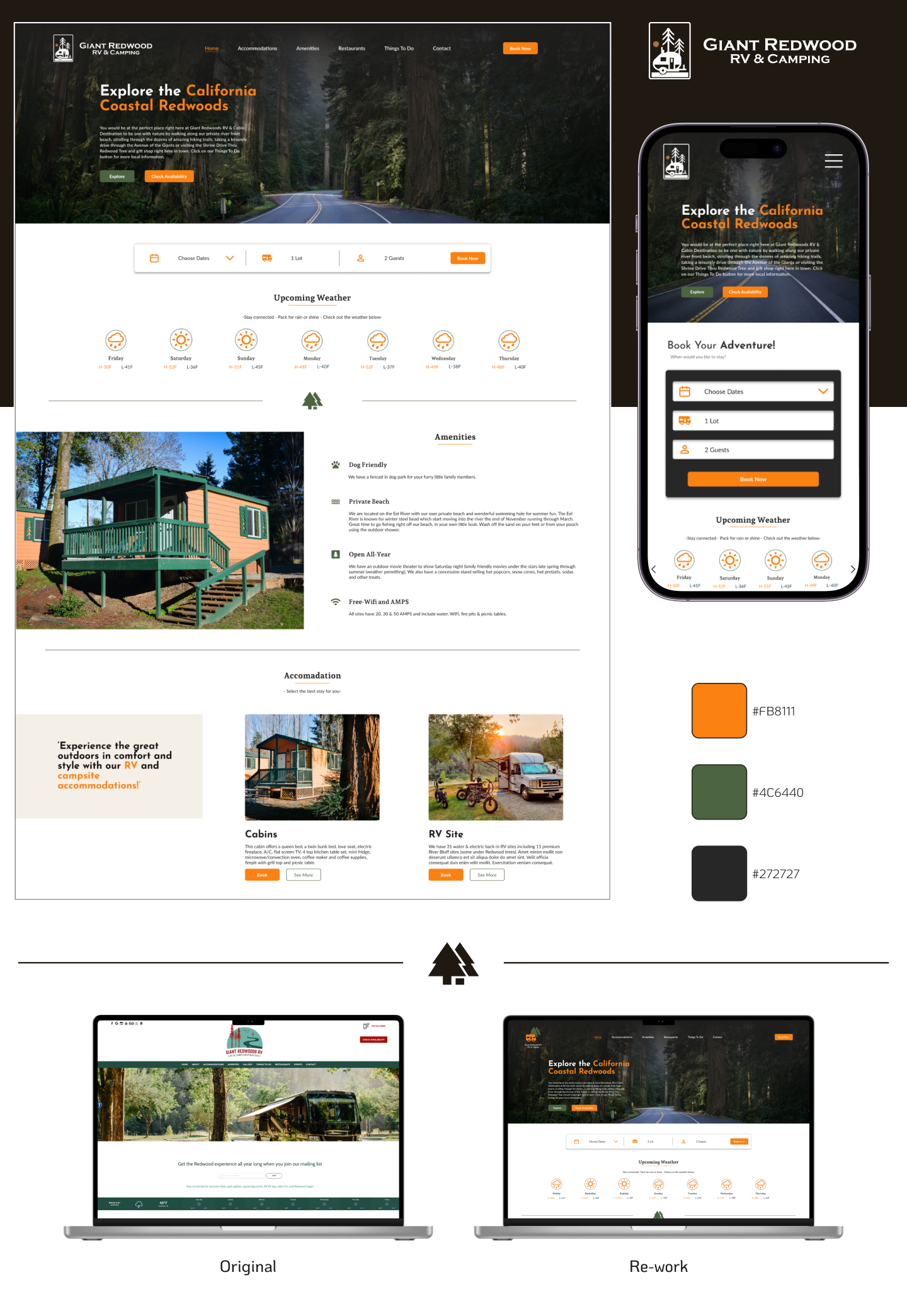
One of the first changes made was to scale the call to action (CTA) button and logo to better fit the page. This was done by bringing the dropdown menu up to give more space to the main content, and updating the logo. This change not only improves the overall aesthetic of the landing page, but it also makes it easier for users to find the information they need.

The branding of the website has also been reworked to incorporate a forest theme with green and a bright accent colour, adding an interesting photo to the landing page, and adding a new paragraph about the location and service offered. This change not only improves the overall look and feel of the website, but it also helps to create a clear brand identity that potential customers can easily recognize and remember.
In addition to these changes, an “explore” page button has been added for customers to easily learn more about the location, service, and pricing. Another CTA button has also been added to prompt users to take action.
This allows users to easily navigate the website and find the information they need without having to search for it.
To further improve the user experience, the CTA has been made sure to appear in the landing page, giving users more options, and adding a booking/quote bar. This allows users to easily book or request a quote, making the process more efficient and convenient for them.
Finally, a customer quote and services section has been added with an eye-catching photo to build trust and credibility with potential customers. This section provides users with a sense of the quality of service offered and gives them a better understanding of what to expect from the business.
Overall, these changes have been designed to make the website more visually appealing, user-friendly, and easy to find the information they need. By making these changes, the website is now better equipped to attract and retain potential customers, ultimately leading to increased sales and revenue for the business.
![]()