Detroit Pizza – Case Study


Project Overview
I got this idea when ordering from a local pizza place. Due to the Pizza place being relatively small and new, they haven’t been able to invest in an app yet. So I thought it could be an excellent project to go ahead with as the company could then be more interdependent and expand into merch and allows users to order pizzas online and track their delivery easily, it could save them time and effort compared to calling a restaurant or ordering in person.


![]()

Overall Problem
Many people struggle to find time to order and pick up pizzas from a restaurant, and delivery options can be expensive or unreliable. Due to this, they have to use a 3rd party app, which means they cannot show their personality and give commission, while having the company’s style and personality.
![]()

Possible Solutions
Enhance the app’s usability: Consider updating the design and layout of the app to make it more user-friendly and intuitive. This could include making it easier to navigate through menu options, find information about ingredients and nutritional information, or contact customer service.
![]()
User Flow


HomePage

![]()
Hi-Fi Screens
Here is the user-flow journey of pizza app. This includes a homepage that showcases the available pizza options and allows users to browse and select different pizzas to order. A menu page that lists the different types of pizzas, toppings, and sides available, along with pricing. A cart page that shows the items the user has selected and allows them to review their order and make any necessary changes before checking out. A confirmation page that confirms that the order has been placed and provides an estimated delivery time. I’ve kept the theme of dark black with the accent colour of pink, to keep in line with the colour style.


![]()
Style Guide

![]()
Colour Pallet

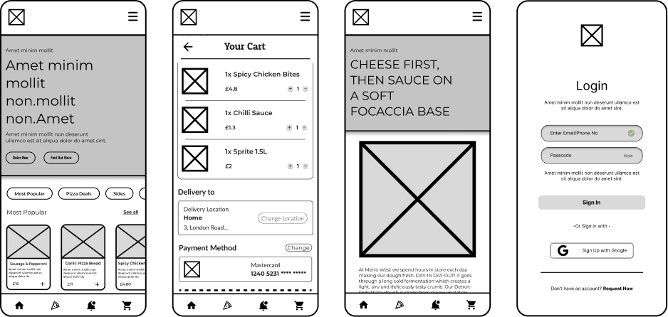
Wireframe
This wireframe illustrates the basic layout and structure of the pizza app, including the main menu, the order form, and the delivery tracking feature. The wireframe shows the placement of key UI elements such as buttons, menus, and text boxes, and indicates the relationships between different screens and features within the app.


![]()

